Experiment results
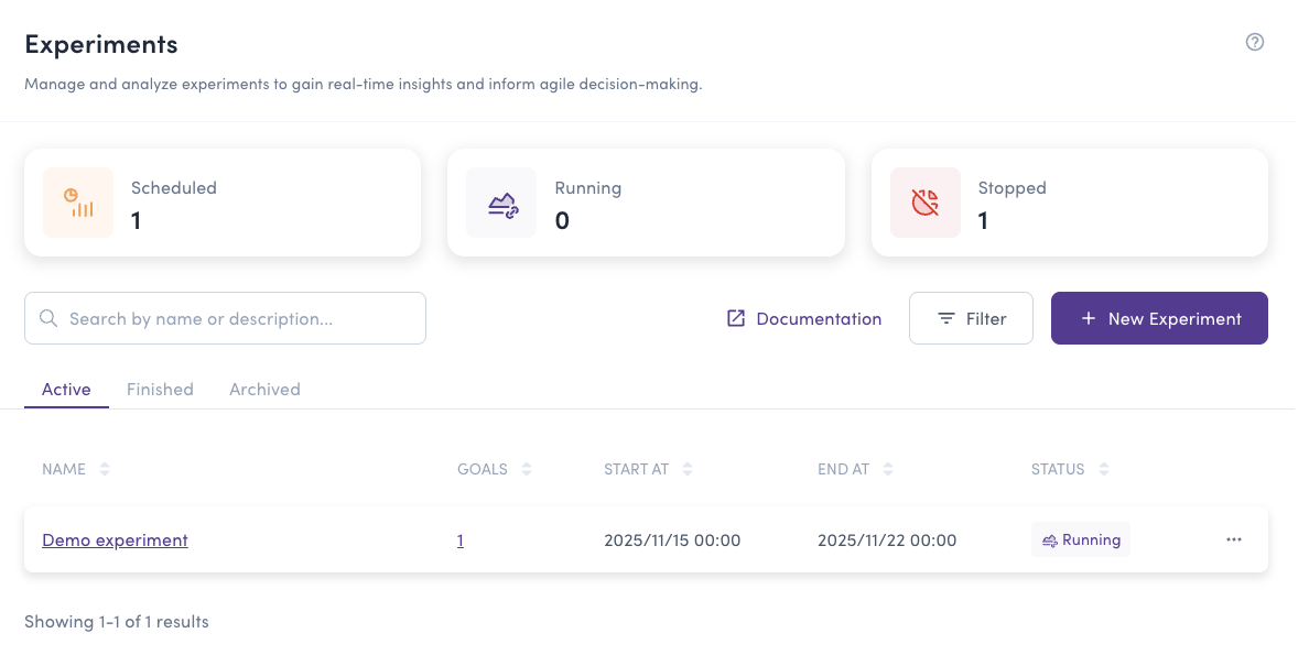
After creating an experiment, it automatically becomes available on the dashboard Experiments tab. Experiments can have one of the following states:
- Waiting: The start date hasn't been reached yet. No data is being collected
- Running: The experiment is actively collecting data about user behavior according to the defined goals
- Stopped: The experiment has been manually stopped or reached its end date
You can access experiment results at any time by clicking the Result button, regardless of the experiment's current status.
You can also check experiment results from the flag details page by selecting the Experiment tab.
Analyzing experiment results
The experiment result page provides comprehensive data to help you make informed decisions:
Page Components
- Experiment header: Shows the current state (Waiting, Running, Stopped), the evaluation period, and the total number of users in the experiment
- Traffic allocation check (SRM): A diagnostic banner that warns you if the observed traffic split doesn't match the configured split (see Traffic allocation check)
- Goal cards: Each goal is shown as its own card. The primary goal is marked with a Primary badge and drives the decision; secondary goals are informational (see Primary and secondary goals)
- Evaluation data table: View user and event counts for each variation
- Conversion data table: Compare performance metrics across variations using Bayesian inference
- Data visualization chart: Track trends over time for any metric
Evaluation Metrics
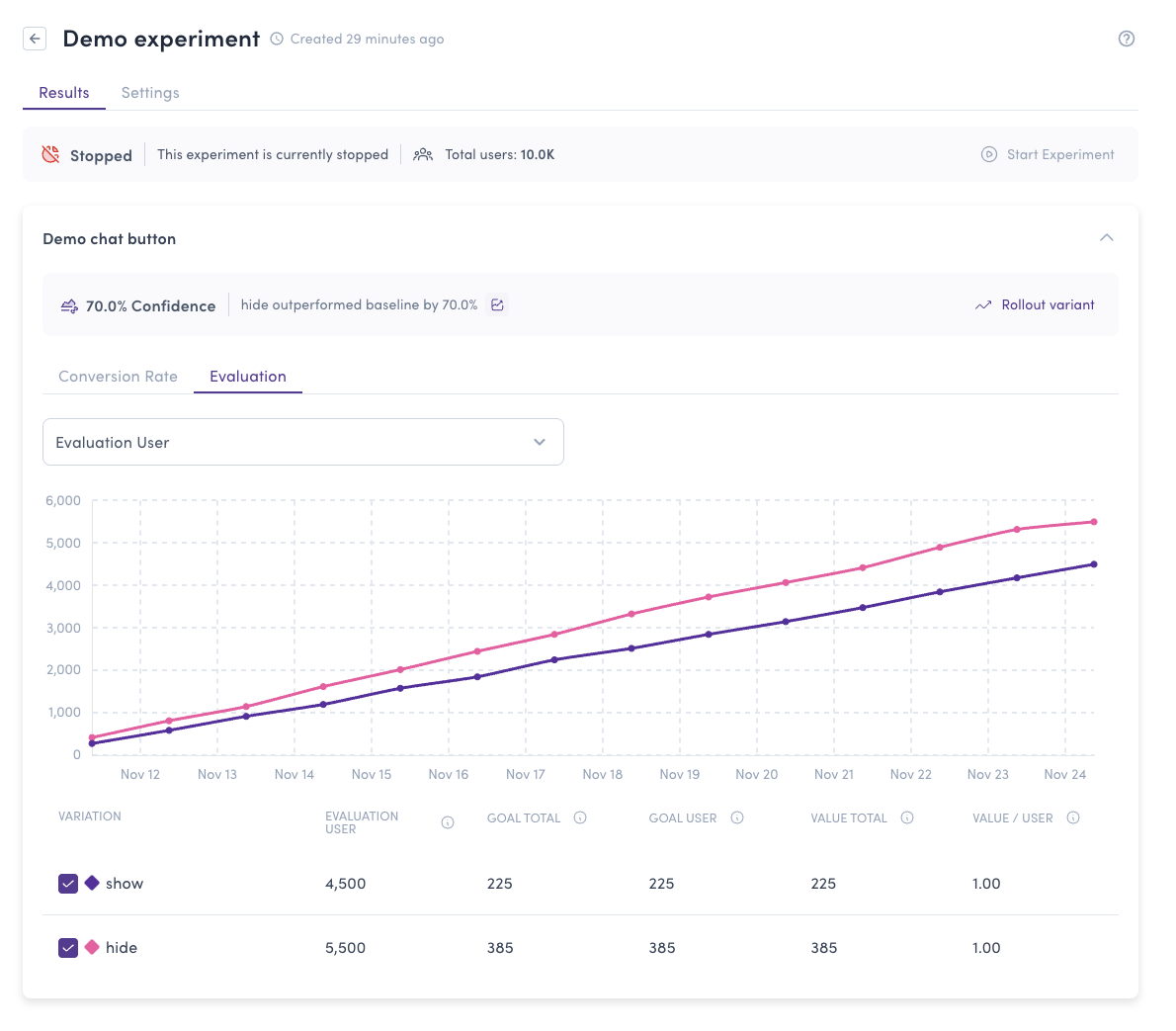
The evaluation table shows fundamental data for each variation:
- Evaluation user: Number of unique users who received this variation from the server
- Goal total: Total count of goal event occurrences, including multiple triggers by the same user
- Goal user: Number of unique users who fired the goal event (counted once per user)
- Conversion rate: Percentage of users who completed the goal (Goal user / Evaluation user)
- Value total: Sum of all values assigned to goal events. Used when tracking metrics like revenue or time spent
- Value/User: Average value per user (Value total / Goal user)
Conversion Rate Analysis
The primary goal card shows a status banner that summarizes the experiment's outcome at a glance:
- Ready to roll out: A variation has accumulated enough evidence that it's safe to stop the experiment and roll it out. The Rollout variant action becomes available.
- Collecting data: The experiment hasn't reached a reliable stopping point yet. Keep it running.
The banner is metric-aware: it reflects the metric you're currently viewing (Conversion Rate or Value/User). It is shown only on the primary goal — secondary goals display their results without a ship recommendation.

The conversion rate table uses Bayesian inference to help identify the best-performing variation:
- Conversion Rate or Value/User: The primary metric being analyzed
- Improvement: The relative lift of this variation versus the baseline, calculated as
(variation − baseline) / baselineand shown as a signed percentage (for example,+12.5%). It reflects the metric currently displayed and shows an em dash (—) when the baseline is zero - Probability to Beat Baseline: The estimated likelihood that this variation outperforms the baseline. We recommend a minimum of 95% confidence
- Probability to Be Best: The probability that this variation is the top performer among all variations. We recommend a minimum of 95% confidence
- Expected Loss: The average opportunity cost of choosing this variation if it's not actually the best. A lower expected loss means less risk of missing out on better performance
A high Probability to Beat Baseline is a single-look snapshot. Repeatedly checking an experiment and stopping as soon as a threshold is crossed inflates false positives. The Ready to roll out status uses an always-valid (sequential) test, so it stays trustworthy no matter how often you look — Collecting data means "more data needed for a peek-proof verdict", not necessarily "no difference".
Expected Loss helps you quantify the risk of choosing a variation. For example:
- Variation A: Expected Loss 2.5% means you might miss out on 2.5% better performance by choosing this
- Variation B: Expected Loss 0.1% means minimal risk - this is likely the best option
Lower expected loss indicates higher confidence that you're making the right choice.
The Bucketeer team recommends selecting a variation with:
- At least 95% Probability to Beat Baseline
- At least 95% Probability to Be Best
- Low Expected Loss (ideally below 1%)
If no variation meets these criteria, continue running the experiment to collect more data.
Data Visualization
The chart at the bottom allows you to visualize any metric over time. You can:
- Select which metric to display (Conversion Rate, Goal Users, Value/User, etc.)
- Toggle variations on/off to focus your analysis
- Observe trends and patterns throughout the experiment duration
Primary and secondary goals
When an experiment has multiple goals, only the primary goal drives the decision:
- The primary goal's card carries a Primary badge and shows the "Ready to roll out" / "Collecting data" banner and the rollout action.
- Secondary goals show the same charts and tables, but instead of a ship recommendation they display a note that the metric is informational. Use them to learn and to watch for side effects, not to decide.
Basing the decision on a single primary metric is what keeps results trustworthy when several metrics are tracked — see Primary and secondary goals for why.
Traffic allocation check (SRM)
Bucketeer automatically checks whether the observed traffic split across variations matches the intended split. A large mismatch (called a Sample Ratio Mismatch, or SRM) usually signals a bucketing or configuration problem that can invalidate the results.
- No banner: The split looks healthy — nothing to do.
- Mismatch warning: The observed counts differ significantly from the configured allocation. Treat the results with caution and inspect the per-variation breakdown to see which variations are affected.
- Check skipped note: The check couldn't run (for example, the flag has no rollout split, or there aren't enough users yet). The reason is shown so you can tell why.
If you see a traffic allocation mismatch, fix the underlying cause (targeting rules, rollout weights, SDK setup) before acting on the experiment's outcome.
Making Decisions
Use Bayesian inference results to make data-driven decisions:
- Clear winner: If the primary goal shows "Ready to roll out" — a variation with a high probability to beat baseline and to be best, plus low expected loss — it's safe to stop and roll out
- Needs more time: If the primary goal still says "Collecting data", extend the experiment or wait for more data, even if the probabilities already look high
- No significant difference: If variations perform similarly, consider other factors (implementation complexity, maintenance cost)
- Watch your guardrails: Use secondary goals to ensure the winning variation doesn't negatively impact other metrics, but make the ship/no-ship call on the primary goal
- Check traffic allocation: If an SRM mismatch is flagged, resolve it before trusting any of the above